Easy-to-Understand Website Analytics With Beautiful UI
I've tried Squarespace analytics, Google Analytics, and now Fathom Analytics.
I used to Squarespace Analytics because, at the time, I was using Squarespace for my website (I'm now happily using Webflow).
I actually didn't have any large complaints with Squarespace Analytics. It's fairly intuitive, has good demographics, and device information.
Since moving to Webflow for my website, I was forced to find a new analytics tool since Webflow doesn't have one built-in.
Enter the web of Google Analytics…
Google Analytics is Overwhelming
I'll admit, I don't think I've explored every aspect and feature that Google Analytics offers, but in some ways, that's my case against it.
When tools are either too complex to understand, or having ugly UI (user interface), people are less likely to stick around.
When I first opened Google Analytics, I felt like I needed to watch many hours-worth of walkthrough videos to be able to properly use it.
I will say, I didn't need any hand-holding when it came to integrating my Google Analytics with Webflow, but that's more of a shoutout to Webflow than it is to GA.
So, is it possible to fall in love with your website analytics?
Introducing Fathom Analytics
When it comes to any tool we use, whether that's an app, a browser extension, a subscription service, or a whole new platform, it needs to be easy to understand, unintimidating, and gets bonus points if it's pretty-looking.
Of course, I say this with some bias, but Fathom really knocks it out of the park on all fronts.
Everything can be done from a single-page Dashboard.
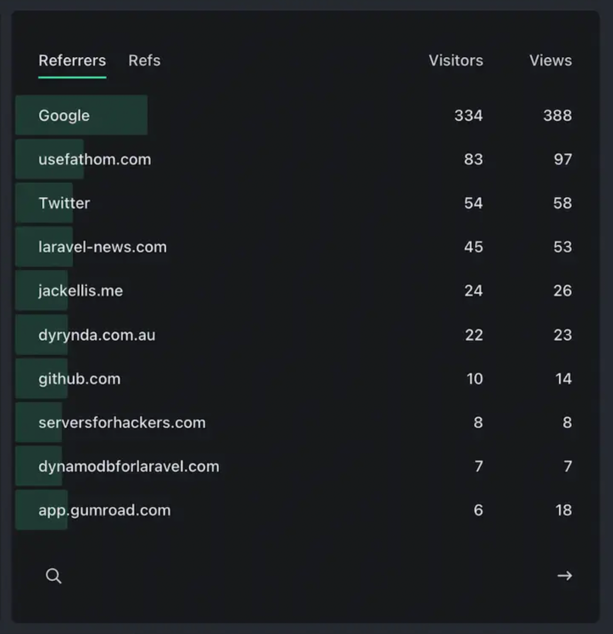
One of my favorite sections on the Dashboard is the Referrers, where you can see how people are finding your site.

For my Dashboard personally, it shows "YouTube" as my top referrer because I have some of my videos from my YouTube channel point to articles I've written or resources I offer.
At a glance, you can also see what country your visitors are viewing from.

I reached out and talked to the good people at Fathom and asked if we will be able to see states, instead of just the U.S. country.
They answer was yes!
So we can expect to be able to see which states our visitors are accessing our pages from.
Fathom Gives You Content Direction
When you use Fathom, you'll find yourself inspired to work on the content on your website.
- You'll find how much time people are spending on each of your individual pages.
- You can see where people came from.
- You can review your bounce rate and if your bounce rate has lowered in the past 7 days, 30 days, this year, and more.
- You'll know which of your articles is performing the best
Your top-view pages are the ones you want to work on improving your call-to-action, or adding more relevant information, links, testimonials, etc.
I highly recommend you at least give Fathom and shot and see how it affects how you feel toward your website—even if you already have a analytics solution, you might be surprised how smooth the experience is on Fathom.
Pro Tip
Use these keyboard shortcuts on the Fathom web app:
- a = Today
- s = Yesterday
- d = Last 7 days
- f = Last 30 days
- g = This month
- h = Last month
- j = This year
- k = All time
These will make your life so much better on a daily/weekly basis. 😎
